Articulate Storyline Web Objects: How to Build Stunning Custom eLearning UI with AI
Learn how to use Articulate Storyline Web Objects with AI to build stunning custom interactions using Tailwind CSS and vector icons without coding.
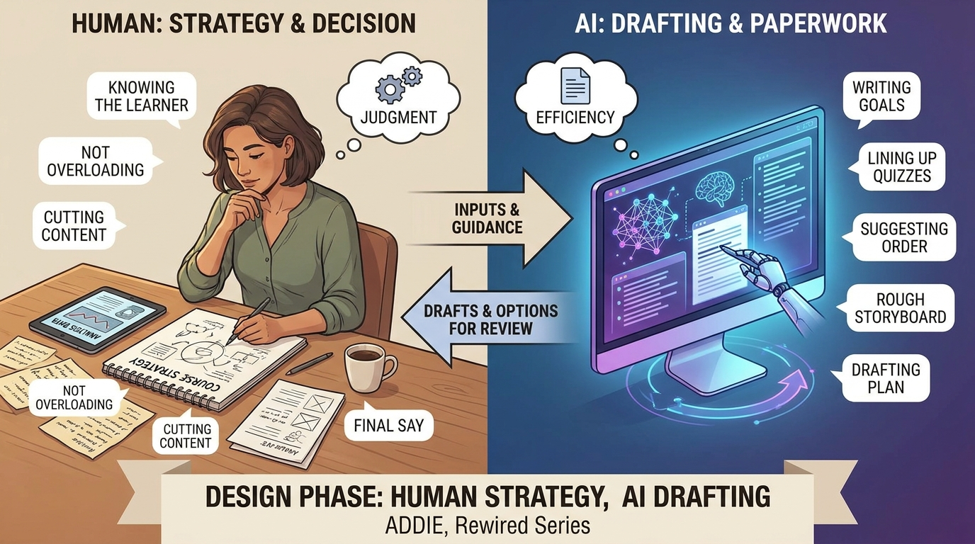
In our last post, we broke down how to take a local folder, have an AI write a quick file, and import it right into Articulate Storyline as a Web Object. We built a basic confidence slider that changed background colors and text on the fly.
It worked, but the raw output looked a bit flat (ehem...fugly). The slider looked like a basic browser widget from a decade ago, the fonts were generic, and the whole layout felt rigid.
The good news is that you do not need to learn web development or hire a programmer to make your custom slides look like a premium application. You just need to change the way you prompt your AI. Today, we are going to look at two secret tools you can ask your AI to use to build stunning Articulate Storyline custom interactions.
Modern eLearning UI Design: Tailwind CSS and Lucide Icons
If you ask an AI to "make it look modern" without giving it specific parameters, it usually writes a messy, complicated block of style code that easily breaks. Instead, we are going to tell the AI to use two specific, pre-built design libraries for our eLearning UI design.
You don't need to know how they work under the hood; you just need to know their names so you can request them in your AI prompt:
- Tailwind CSS for Storyline Layouts: Think of this as a massive library of modern design presets. Instead of the AI writing pages of custom layout code from scratch, Tailwind lets the AI use simple shortcuts for things like rounded corners, soft drop-shadows, and elegant spacing. It keeps your Storyline HTML5 output lightweight and perfectly styled.
- Lucide Icons for Vector Graphics: Text clues are boring. Instead of hunting for PNG icon images online, resizing them, and hoping they do not look blurry on high-resolution screens, we can let the AI use Lucide. It is a massive collection of crisp, minimalist vector icons that the AI can instantly drop onto the screen to match your course content.
By forcing the AI to use these two design shortcuts, we can completely transform our basic slider from the last article into a beautiful, fluid custom eLearning interaction.
The Advanced Storyline Web Object Prompt
Let's upgrade the exact same confidence slider project from our first Storyline web object tutorial. This time, we are telling the AI to apply a modern color palette, a custom styled slider bar, crisp vector icons, and smooth fading transitions.
Simply open the index.html file we created earlier and copy and paste this upgraded prompt template into your favorite AI tool (yes, replace everything).
Notice how we are setting strict visual guidelines so the AI knows exactly how to style the final product.
AI Prompt for Premium Storyline Interactions
Create a highly polished, production-ready interactive Web Object for an Articulate Storyline slide. It must be completely self-contained within a single index.html file including all HTML, CSS, and JavaScript.
Design & Layout Constraints:
- Fixed 16:9 Canvas Viewport: The root container must be precisely hard-coded to 960px width by 540px height to natively occupy a standard landscape eLearning slide frame without scrolling artifacts or looking like an isolated card widget.
- Standalone CSS Architecture: DO NOT load external runtime CSS compilation utilities (such as dynamic Tailwind scripts like cdn.tailwindcss.com) which throw production console warnings. Rely entirely on raw, performant internal vanilla CSS styling.
- Scrollbar Prevention: Set html and body elements to overflow: hidden and completely suppress default browser layout scrollbars using standard CSS properties and webkit engine targets.
- Elegant Typography Stack: Use a clean, modern sans-serif system font stack (e.g., system-ui, -apple-system, BlinkMacSystemFont, "Segoe UI", Roboto, Helvetica, Arial, sans-serif) with generous line heights and kerning.
Interactive 3-Step Confidence Slider:
- Provide an HTML range input (`<input type="range">`) with exactly 3 snapping values: 1 (Low), 2 (Medium), and 3 (High). Default starting step must be 2.
- Position 3 matching text labels ("LOW", "MEDIUM", "HIGH") directly beneath the slider track, utilizing explicit width properties and alignments so they line up directly beneath the 3 selector positions.
- When a user hovers or drags the range handle, it must execute a smooth hover transition state, increasing the scale of the thumb selector slightly (e.g., scale(1.18)).
Pixel-Perfect Slider UI Requirements:
- Use -webkit-appearance: none; and appearance: none; to wipe default browser input engines.
- The Track: Give the track a height of exactly 10px, rounded pill corners, and a semi-transparent dark tint (e.g., rgba(0, 0, 0, 0.08)) so it cleanly overlays and blends into changing background fields.
- The Thumb: Provide a smooth 26px by 26px vibrant indigo circle (#4F46E5). To ensure pixel-perfect vertical centering across Webkit, Blink, and Gecko browser engines, use explicit negative top-margin calculations (e.g., margin-top: -8px) on webkit targets to bisect the track perfectly. Apply the identical scale, color, and positioning rules across both ::-webkit-slider-thumb and ::-moz-range-thumb selectors.
Dynamic Feedback Area & Background Morphing:
- Slide Canvas Background States: Moving the slider must smoothly transition the background color across the entire 960x540 canvas via CSS transitions:
* Step 1 (Low): Transforms canvas to a soft red tinted background (#FEF2F2).
* Step 2 (Medium): Transforms canvas to a soft yellow/amber background (#FFFBEB).
* Step 3 (High): Transforms canvas to a soft green tinted background (#ECFDF5).
- Centered Container Box: Place a spacious content container card near the bottom. Inside, display a dynamic vector icon loaded via a standard script tag (use Lucide Icons CDN) right next to a line of dynamic feedback text.
- Mapping State Rules:
* Step 1: Text reads "No worries, we'll start with the basics." Icon must change to a book-open design nested inside a light red icon wrapper.
* Step 2: Text reads "Great, we will practice your skills." Icon must change to a wrench design nested inside a light indigo icon wrapper.
* Step 3: Text reads "Excellent! Let's test your expertise." Icon must change to a trophy design nested inside a light green icon wrapper.
- Micro-interactions: Animate the feedback content container using a rapid, elegant 120ms fade-and-transform opacity translation so text and icons blend smoothly into view instead of clipping abruptly.
Asynchronous Javascript Order of Operations:
- Browser Safety Routing: The interaction must process DOM adjustments (updating the background classes, text fields, active label highlights, and Lucide vector triggers) first before executing any cross-window parent player API commands.
- Storyline Interface Bridge: Inside a safe, sandboxed try/catch block at the very end of your execution loop, pass the selected text values ("Low", "Medium", "High") back to a global Storyline variable named "LearnerConfidence" via parent.GetPlayer().SetVar(). This structure ensures that testing the file directly as a local asset ("file:///") will fully animate and render local color changes without being halted by browser CORS security errors.
Provide only the complete, functional code blocks inside a single code bracket.
Reviewing the Custom Storyline HTML5 Output
Once the AI hands you the new code, save your index.html file inside your project folder and open it. It should open a browser that will allow you to see the webslide. Feel free to tweak anything by telling AI what you want changed.
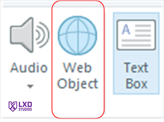
When you're happy, insert the entire folder as a web object like we did last time.. This is an important step.
You will immediately see the difference a design-focused prompt makes. The slider track will be perfectly rounded, the typography will use elegant, clean fonts, the main card will float with a soft drop-shadow, and the vector icons will smoothly swap and fade as you move the slider.
You get a bespoke, premium interface element that looks completely custom-built for an advanced web app, and all you did was write a smarter AI prompt.
In our next eLearning development tutorial, we will look at how to take this aesthetic setup and start adding dynamic images and visual assets into your Web Object workflows. Stay tuned!